 |
| Newsletter Printing |
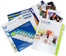
Many companies take advantage of newsletter printing because it is a way to maintain a connection with customers by offering advice, tips, updates, and other helpful or interesting tidbits. Newsletters can also create a bond between customers by including articles written by readers, letters to the editor, or testimonials. By encouraging relationships among consumers, a business will develop loyalty with their clients, something that is needed for a strong brand. In order for a newsletter to be a connection point between a business and customers, it must be readable. No company wants to waste valuable time and money by designing a newsletter that does not get read. Avoid the following common mistakes:
A busy nameplate, also called the newsletter title - Keep the name short by avoiding unnecessary articles at the beginning of the name and other pointless words. For instance, instead of The NoName Newsletter of Nowhere County try NoName of Nowhere County or simply NoName. Also, place your logo elsewhere than in the nameplate, such as at the bottom of the page or on the back.
No white space - Too much text without any breathing room blurs the information together creating a visual of huge blocks of gray. For readability purposes, use substantial margins and leave white space around all headlines, subheaders, and columns.
Too many boxes and borders - Enclosing every section in a box muddles the newsletter making it cumbersome to skim the information, let alone read it. Use borders sparingly and only when needed to set extra or important information apart.
Too much color - Use only one color in the nameplate, and use this color for every newsletter for developing a consistent image. Throughout the newsletter use mostly black, especially for text, and a second color sparingly. If you do decide to include colored text, limit it to the headlines.
Underlining - When headlines or other important information is underlined, it not only gives a newsletter an amateur look but also makes the text difficult to read. Underlining hides letters like ""j"" that have descending tails. For making important text stand out, use a larger font size.
Newsletter printing should always be easy to skim through, especially if you want to reach even those customers who do not have time to read word for word. Think simplicity in your design and you should be able to create a newsletter that helps to develop a strong customer following for your company.


0 comments:
Post a Comment