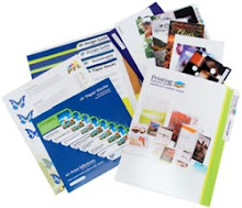
If you are like many publishers of your organization's newsletter, you probably wish that a few more people were reading it. You occasionally run into people who are aware of your company but who simply don't have any idea that you publish your newsletter. Maybe you should think about upgrading the design in order to build interest. Have you looked at the key elements of the newsletter design, size, title, font, number of pages, layout scheme, photography? All of these elements work together to make an overall impression. If you break the individual elements down, you may find that small changes in each element will have a multiplier effect, and the overall look of the newsletter will improve drastically.
Let's look at some of these ideas. First, start with the name. Do you need a name change for your newsletter? Does the name tell readers anything valuable? If the name of your company is Jones Bros. Contractors, would the name of the company serve as a good title for the newsletter: The Jones Bros. Report. What does that tell anyone? Let's say that Jones Bros. makes awnings. Now we have something to work with. The word awning needs to be in the title; that tells anyone what the newsletter is about. It's really much better to come up with something informal and memorable rather than stick with something formal which doesn't really say anything.
Another idea that you can consider is making your front page very compelling. You are not writing a tabloid, of course, but there's nothing wrong with strong, hard hitting headlines in bold type. Your goal has to be to compel interest. If your organization has stories that you think are interesting, you have to find ways to convey that idea.
Another idea is to use guest columns. These are columns that are written by members of the organization to express a point of view that may be unique or different. You want to keep people involved and interested in your organization, and giving participation opportunities to a number of people is a good way to go about it.
If you are not using color photography, you should be doing that as well. Many newsletters are printed without much in the way of photography or graphics, but these are usually the best draw available. People are interested in high quality photography and graphics, and this will pull interest more than just about anything else.


0 comments:
Post a Comment